London’s Living
concepting \ advertising \ copywriting \ campaign
This project proposed a bold, hypothetical sub-brand of Transport for London (TfL) aimed at transforming the daily commute into a more uplifting, health-conscious experience - particularly for disadvantaged communities in the city. The strategy combined branded campaign thinking with OOH (Out-of-Home) interventions, reimagining the transport network as a catalyst for well-being.
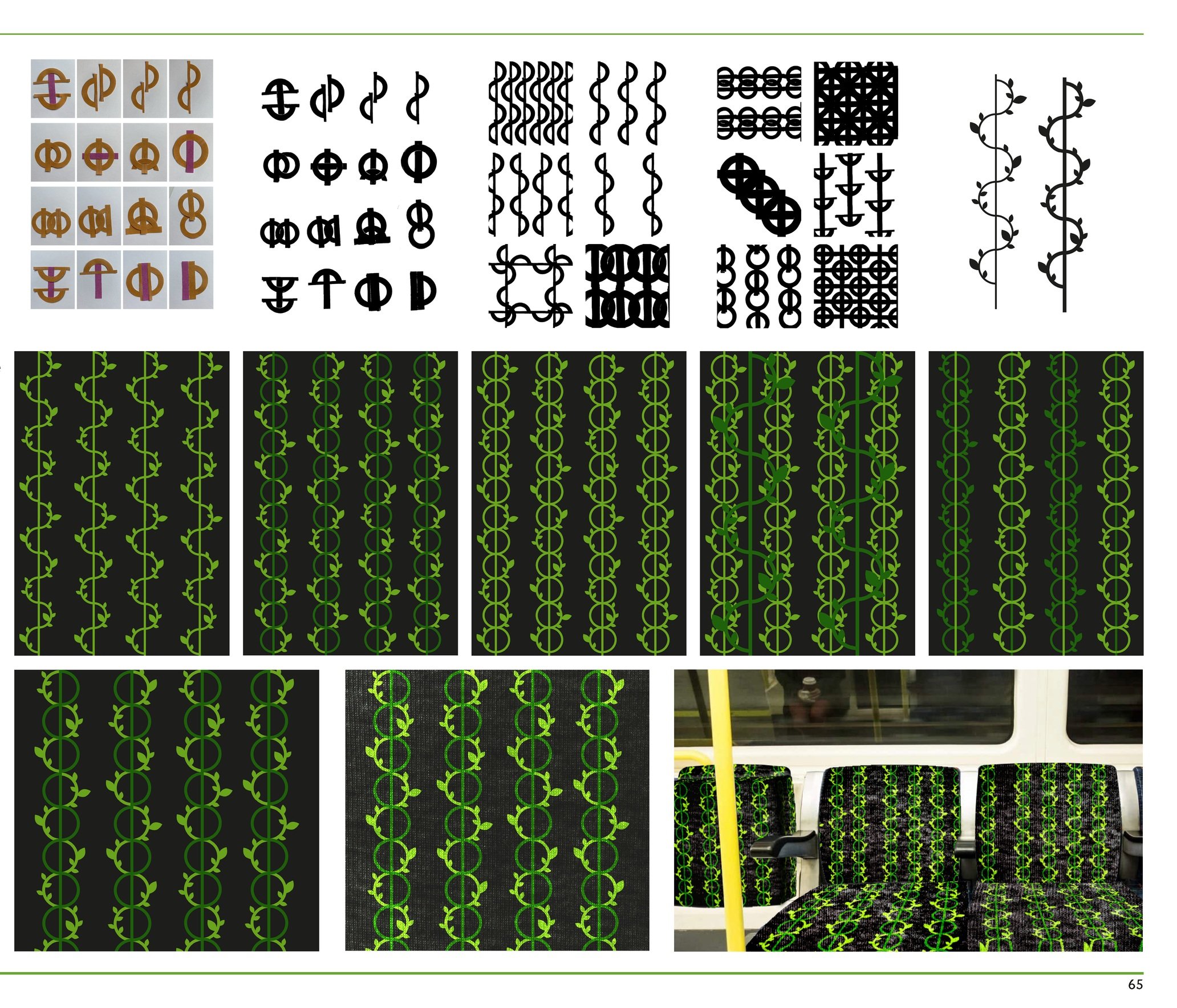
Key touchpoints included turning underground station signage green, transforming select stops into pop-up plant shops, and introducing a new “Living Line” fabric for tube seats - featuring botanical textures and patterns to bring the outdoors inside. These visual and tactile changes were designed to create brief, repeated encounters with nature throughout a commuter's day.
In parallel, the TfL app was redesigned with improved UI and UX features to promote nearby green spaces, walking routes, and moments of pause. The ultimate goal: introduce just ten minutes of greenery daily, helping to improve mental health, boost mood, and contribute to longer, healthier lives for all Londoners.


Concept to Creation


