What’s Hot?
brand identity \ digital design \ newsletter
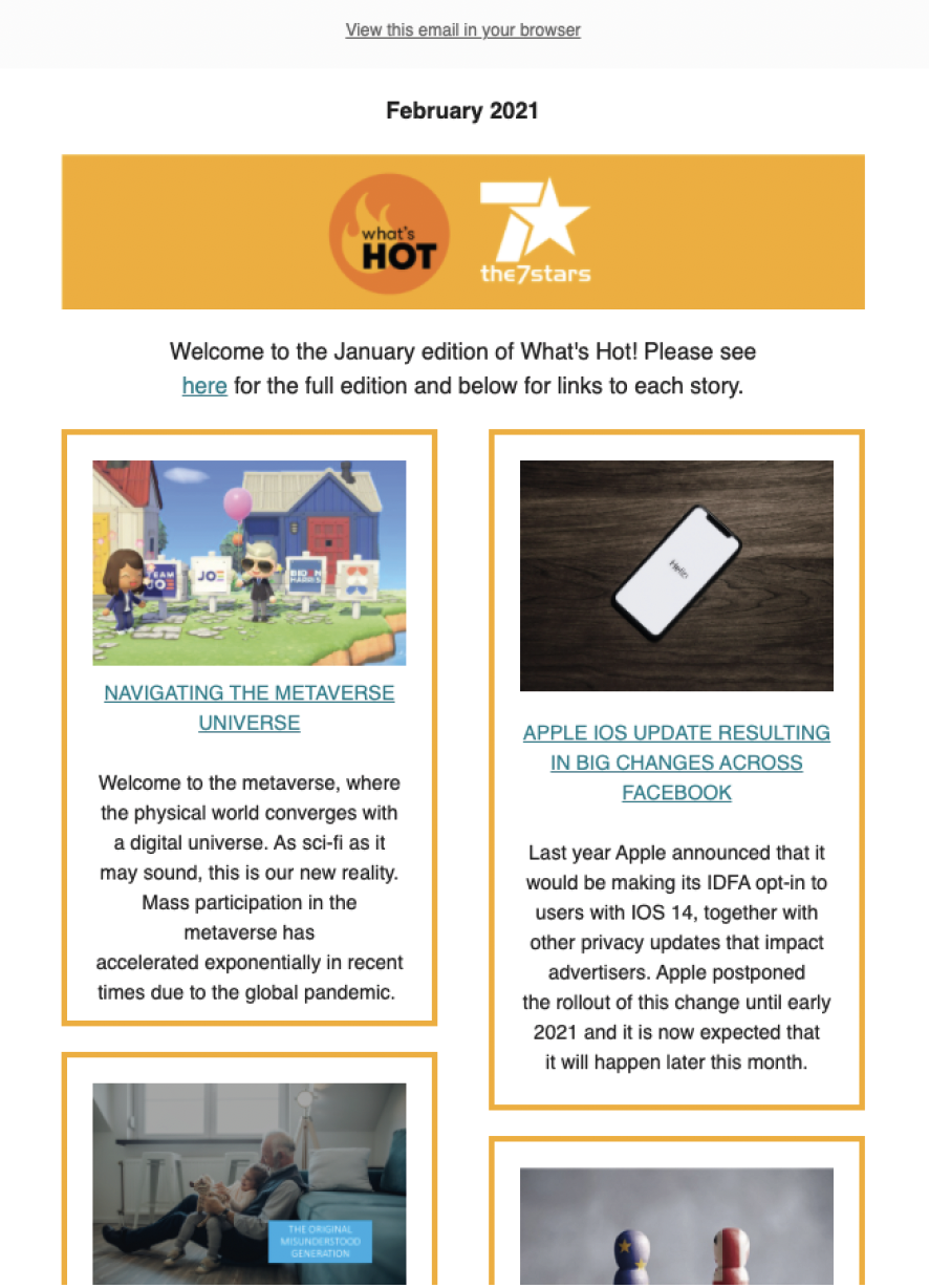
An updated brand identity and refreshed newsletter design were created for What’s Hot, the trend and insight publication from multi-award-winning agency the7stars. The aim was to keep the newsletter visually engaging and strategically relevant, while aligning it with the agency’s bold, independent brand voice.
Maintaining a strong connection to the7stars’ core identity, the newsletter was also given its own standalone design features; striking layouts, refined typography, and improved hierarchy, to help it stand out as a distinct thought leadership piece. These updates not only enhanced readability and visual appeal but also strengthened the newsletter’s authority within the media and marketing sectors.
As a result, What’s Hot has continued to grow in reach and reputation, now landing in the inboxes of thousands of recipients across hundreds of leading companies, and reinforcing the7stars’ position as a forward-thinking voice in the industry.

Concept to Creation


